

Primary colours
Primary colours are three key colours - Red, Blue and Yellow. They cannot be made from any other colour.
Secondary colours
If you mix equal amounts of the primary colours, you get the Secondary colours - Purple, Green and Orange.
Red + Yellow = Orange
Red + Blue = Purple
Blue + Yellow = Green
Tertiary colours
If you mix a primary with a secondary colour, in a ratio of 2:1, you get a Tertiary colour. Red-Orange, Blue-Green etc.
Cool versus hot
Look at the colour wheel and you will see the left hand side of the colours are 'cool' or 'cold' and the ones on the right are 'warm' or 'hot'.
This is useful when you want to create a mood in a particular room or need to make your space cosier or lighter.
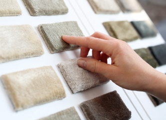
Neutrals
Neutrals are one of the easiest groups of colours, or non-colours to work with. They don't appear on the colour wheel and include Black, Grey, White and sometimes Brown and Beige. They all go together and can be layered and mixed and matched. No neutral colour will try to dominate over another.
Accent colours
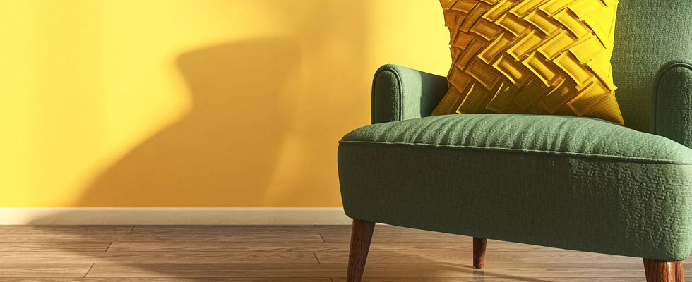
An accent colour is a colour used in quite small quantities to lift or to add punch to a colour scheme.
* An accent colour should be in a complementary colour. It works best if it's a bright, vibrant colour. Accent colours are perfect if you're scared of using strong colour - simply add a splash of an accent colour with a cushion, a vase or a throw.
* Keep most of your room in shades and variations of one single colour. Choose a number of items in a harmonious colour. Then pick out just a few objects in an accent colour.
Clashing colours
To use clashing colours is thought to be a no-no. At weddings, everyone is worried that the mother of the bride will clash with the mother of the groom. But in the home, if they are used carefully, they can look fantastic.
If they are of equal tonal strength, you can mix them together. Don't stop at two, you could try three or four. But if one is paler or weaker than the rest it will get lost in the overall scheme.